Lessons in graphic design : Words as images
Let’s get this straight once and for all: typography does not equate font. People often get the two mixed up, and if the French use of the word “typo” ( pronounced tee-poh, a condensed version of “typography”) to designate “la police” aka “the font” and designate actual typography is any testament to how blurred the lines have become between the two ideas, we should be a bit worried.
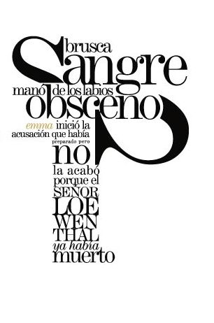
Why all the fuss? Typography is a process, not a style element. It’s considered a trade by some but the (true) definition you’ll most often hear is that typography is the art of arranging type. It involves choosing fonts, point sizes, line lengths and spacing, as well as the manipulation of spaces between groups and of letters.


In the end, the font has its role to play here, but the thought that this one element of typography could convey an entire idea the way good typography does, completely misses the mark.
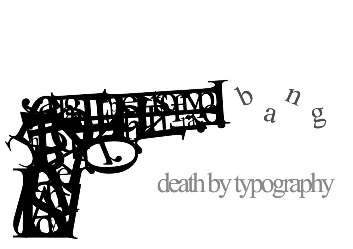
Artists and designers have used typography not just to illustrate word definitions, but to create images as well, and often, in order to drive the point home, young designers will be taught to illustrate an idea by placing letters on paper without ever spelling out a single word, before they can move on to composing ideas using any kind of written language.
Artist Ji Lee who recently created a clever video titled Word as Image in honor of the upcoming release of his new book by the same title, seems to be quite aware of the uncertainty surrounding the term.
Taking typography off the page and exposing it on the screen is a tricky task. Add to that the idea that Lee uses only letters as graphic elements in the ideas he chooses to illustrate and you’ve got a piece of work that straddles the fine line the French use of the word illustrates so well.
Also, if you’re interested in the basics of typography check out this very insightful infographic by Noodlor:
Let's get this straight once and for all: typography does not equate font. People often get the two mixed up, and if the French use of the word "typo" ( pronounced tee-poh, a condensed version of "typography") to designate "la police" aka "the font" and designate actual typography is any testament to how blurred the lines have become between the two ideas, we should be a bit worried.
Why all the fuss? Typography is a process, not a style element. It's considered a trade by some but the (true) definition you'll most often hear is that typography is the art of arranging type. It involves choosing fonts, point sizes, line lengths and spacing, as well as the manipulation of spaces between groups and of letters.


In the end, the font has its role to play here, but the thought that this one element of typography could convey an entire idea the way good typography does, completely misses the mark.
Artists and designers have used typography not just to illustrate word definitions, but to create images as well, and often, in order to drive the point home, young designers will be taught to illustrate an idea by placing letters on paper without ever spelling out a single word, before they can move on to composing ideas using any kind of written language.
Artist Ji Lee who recently created a clever video titled Word as Image in honor of the upcoming release of his new book by the same title, seems to be quite aware of the uncertainty surrounding the term.
Taking typography off the page and exposing it on the screen is a tricky task. Add to that the idea that Lee uses only letters as graphic elements in the ideas he chooses to illustrate and you've got a piece of work that straddles the fine line the French use of the word illustrates so well.
Also, if you're interested in the basics of typography check out this very insightful infographic by Noodlor:

