Food Trucks Are The New Canvas
Meet the Other Culinary Art
Food trucks are everywhere these days. There are nearly 60 food trucks in Montreal alone, each with its own theme, concept and design. Owners personalize their trucks to differentiate them from a growing collection of mobile food stands and to attract the herds of summer frolickers looking for a place to satiate their hunger.
These days, the term “culinary art” has taken on a whole new meaning with the rise of food truck culture,art being the operative word. The eat-on-the-curb craze has given rise to an eye-catching and mouth-watering world for foodies to explore. With the overwhelming number of options available to potential customers today, truck adornment has become a big focus for vendors that really want to showcase what their food is all about for the people they serve.
We see a food truck well before we taste the deliciousness it is serving, and as the expression goes, we do judge this book by its cover. Food truck art is more than just a logo; it creates an ambiance, just as the decor in a restaurant does, and gives the hunger-stricken a feel for the personality of the chefs behind it. The smell of smoking meat aside, it’s both the hook and the reel.
We say that the watchwords for successful food truck art are wit and consistency. In a prolific sea of metal and wheels, how do you choose your truck? WRG magazine spoke with some of the biggest names on the food truck scene to learn more about the inspiration behind their branding. We also sat down for a every special interview with the main man in sign design, the aptly named Mr. Sign.
ODE TO CHEESE
Looking at a greasy hangover brunch one morning, high-school buddies Pascal Salzman, Ketan Patel and Jared Dunawa decided to turn their love of starch and cheese into a business venture. They bought an old Purolator truck and cheesified.
WRG spoke with Pascal, who launched with Le Cheese in July of last year. Since then, has enjoyed success after success, culminating in the recent opening of a Le Cheese restaurant in Monkland Village – exactly one year after their food truck hit the streets. Consider Pascal, Ketan, and Jared the Big Cheeses, Senseis of Dairy, if you will.
Le Cheese’s truck is constantly on the move, which means the boys had brand themselves in an instantly recognizable way to maintain constant curb appeal. We spoke to Pascal about the motivation behind the single-hued design of his truck.
“The artistic concept behind our truck is very simple. Essentially, we wanted our truck to look like a huge brick of cheese from a distance. I would say a lot of the stereotypes people make about guys who drive big cars would apply to food trucks. The more razzle-dazzle on the truck, the more they are trying compensate for something else.”
If that’s the case, it’s fair to say these guys are confident about their food, and likely some other things too… The exterior sidewall of their new restaurant will be colored with the same unmissable yellow base, while the chairs in the new joint will sport yellow accents. Clearly Le Cheese thinks harmonious branding is the way to go.
Pascal wouldn’t share the recipe for his now famous mac & cheese (inspired by his mom, in case you were wondering), but he did tell us about the serendipitous moment that made his dish the hit that it is today:
“The oven on the food truck broke on one of our first days so we had to cook the Mac and Cheese on the flat top to wing it and it ended up being amazing. We thought we had a disaster on our hands but it ended up being our iconic dish.”
BY THE SEA
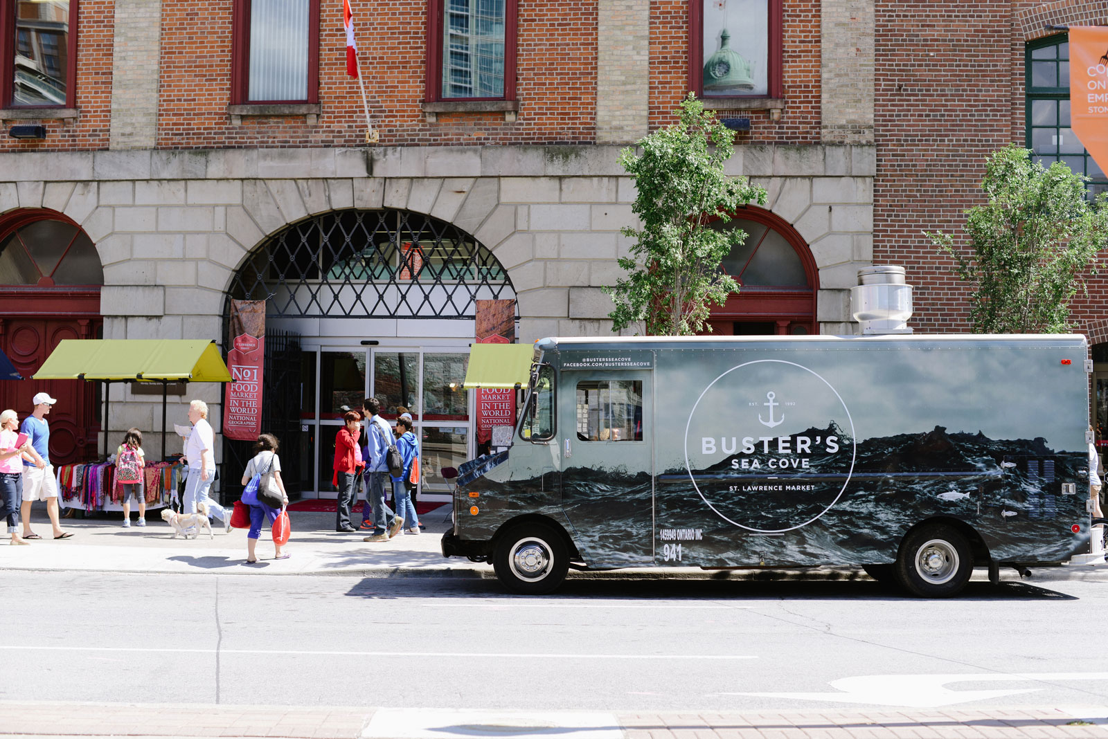
Tom Antonarakis and Quenten Chan’s Buster’s Sea Cove fish fry is anchored in Toronto’s St. Lawrence Market; a fixture in what National Geographic voted the number 1 market in the world. Their food truck, most often parked on Queen St. East or Jarvis St. brings a little bit of the sea to the city.
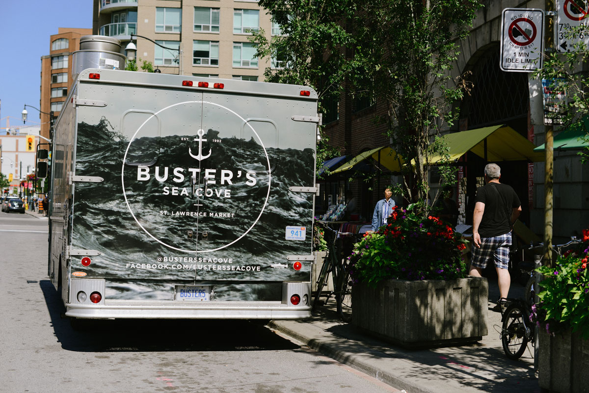
The concept behind their truck art is to evoke the scent and sensation of being by the ocean for anyone who catches a glimpse. While the design isn’t quite as simple as Le Cheese’s, there’s no doubt it does inspire the senses, which is always an effective alternative when it comes to food.
“I want the art on our truck to make people to feel like they are by the sea, fishing for lobster in the water surrounded by waves. That feeling of being young and free,” says Tom.
Tom came to Canada from Rodos, Greece when he was eight years old, but he never forgot the epic feeling of having the sun shine on his face and a saltwater breeze float past his nose. He could no longer dip his toes in the water, so instead he wet his feet in the world of mobile food. We asked Tom about the adornment on his truck and what he thinks is most important when branding a restaurant on wheels.
“The artwork on the truck creates the mood and atmosphere for people to want to eat the food. If we just had an obscure logo, or a solid color, it would be a waste of the canvas. The truck’s vibe needs to connect to the food. The waves on the truck are in motion and it gives off an exciting energy to the city amblers.” Well put, Tom.
Buster Sea Cove’s most popular dish is their lobster roll; because really, who isn’t addicted to creamy lobster in a toasted bun with mayo, chives and lemon. Their great surfer truck design and seaside flavor make for a very nice spot to curbside kick-it with a beach chair.
Don’t mind if I do.
OH BOY, MR. SIGN
After interviewing the unique and wonderfully talented Dave Arnold, it became clear where many of Montreal’s finest food trucks and eateries get their character.
Dave started his company, Mr. Sign, in 2009 when he began reproducing clients’ existing logos and artworks with a paintbrush. I would paraphrase the rest of his story for you all, but I don’t think anyone can say it better than Dave himself, who insisted on keeping all profanities uncensored because…
…“It always drives me insane when full grown adults pretend that swear words don’t exist,”. We hear you Dave – say whatever the fuck you want to say.
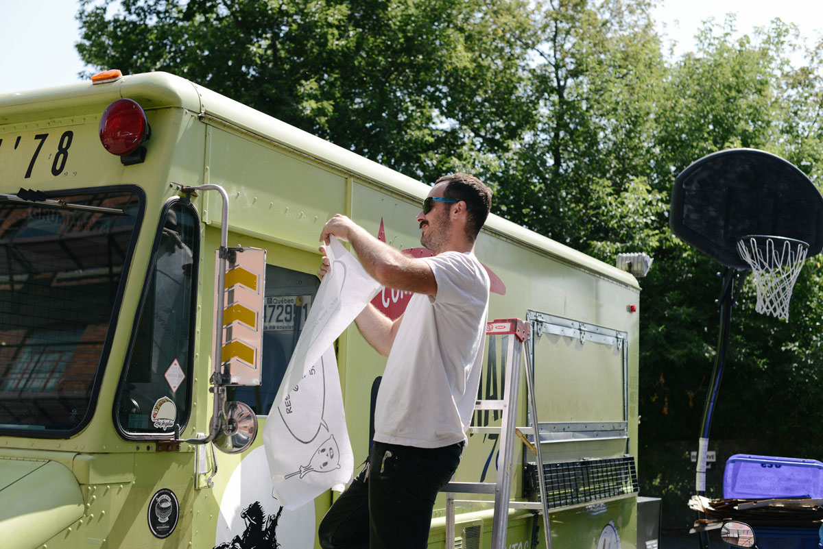
I asked him to fill us in, from an artist’s point of view, on what is most important when creating signature signage, especially on a canvas as large as a truck. While he by no means answered the question explicitly, he did answer many other questions that I did not ask, and for that I am grateful:
I started a sign painting company five years ago. The first year or two, I was just reproducing client’s existing logos and artwork with a paintbrush on whatever surface. I started doing original designs for people’s signage. Funny thing was, the ‘sign designs’ were blowing their shitty-ass logo designs outta’ the water, so they just started using my sign designs as their new logo. This led to a couple [of] major financial snafus for my young company, wherein I sold people SPICY, custom logos for 300 bucks. Looking back now, there’s no hard feelings, except for the deep hatred I have for these savvy businessmen and women who took full advantage of an innocent young soul. Long story short, I clued in that I was getting turbo-screwed by these jokers, so I started a design company within the sign company. Now, if you want anything original, there’s a design stage and a design bill, and then a sign stage and a sign bill; like a normal company!
From a design perspective, food trucks are no different than any other business; if it looks good, you’ll get people in the door (or to the window on the side of your food truck, as the case may be). Once they’re in the door, it’s out of my hands. If a food truck serves fermented dog turds in a hot dog bun, it won’t matter how sweet the design on the side of the truck is; the word’s gonna spread pretty quick that you blew it. On the other hand, if you serve up a little slice of heaven, that word’s gonna spread pretty quick too. My job is to get people in the door.
As for the design itself, I’m not only hell-bent on giving people something that’s unique to them personally; it needs to be something that somehow communicates the feel, or vibe that they want their customer to experience. If your truck’s serving kosher biscuits, and your truck looks like a 1998 rave party, somebody shit the bed. Same goes for the opposite; if you’re serving a hamburger with donuts for buns, the whole thing’s covered in sprinkles and sparklers, and your truck looks like ‘Grandma’s Olde Tyme Diner’, you beefed it. The design must accurately suggest what’s behind the door.
The only connection that I ever try to develop between any business owner and myself is, “We have a very fucking serious project to work on here. Tell me exactly what you’re picturing.” If someone’s able to clearly communicate what they’re picturing, their loves, their hates, their goals, their fears, their target market, their vision as a whole, we always crank out tasty imagery. As a result, a bunch of people come through the door and they take it from there. If someone is unable to communicate all that info, I’ve got nothing to work with. That information is the ingredient. Gimme the ingredients, I’ll whip up a tasty gumbo. Gimme a bunch of bullshit and confusion and mixed opinions and second guessing, we’re gonna be eating a fermented dog turd in a hotdog bun, every time.
I hope this helps to give some insight into the disgusting and terrifying world of sign painting and food trucks. It’s not pretty, until it’s all painted up pretty, and then it’s the prettiest thing you ever saw. I’d even go as far as to say ‘funky fresh flavor’, if you’ll pardon the expression.
I do pardon the expression. “Funky fresh” is the perfect way to describe what food trucks are all about. Their flavor isn’t just about the food being served. The urban phenomenon that is the food truck is a modern version of what greasy street-food vendors and ethnic eateries have been serving on the city streets for decades combined with the flexibility of selling on the move, and the freedom that comes with a full artistic license. A real feast for the stomach and the eyes.
Food trucks are everywhere these days. There are nearly 60 food trucks in Montreal alone, each with its own theme, concept and design. Owners personalize their trucks to differentiate them from a growing collection of mobile food stands and to attract the herds of summer frolickers looking for a place to satiate their hunger.
These days, the term “culinary art” has taken on a whole new meaning with the rise of food truck culture,art being the operative word. The eat-on-the-curb craze has given rise to an eye-catching and mouth-watering world for foodies to explore. With the overwhelming number of options available to potential customers today, truck adornment has become a big focus for vendors that really want to showcase what their food is all about for the people they serve.
We see a food truck well before we taste the deliciousness it is serving, and as the expression goes, we do judge this book by its cover. Food truck art is more than just a logo; it creates an ambiance, just as the decor in a restaurant does, and gives the hunger-stricken a feel for the personality of the chefs behind it. The smell of smoking meat aside, it’s both the hook and the reel.
We say that the watchwords for successful food truck art are wit and consistency. In a prolific sea of metal and wheels, how do you choose your truck? WRG magazine spoke with some of the biggest names on the food truck scene to learn more about the inspiration behind their branding. We also sat down for a every special interview with the main man in sign design, the aptly named Mr. Sign.
ODE TO CHEESE
Looking at a greasy hangover brunch one morning, high-school buddies Pascal Salzman, Ketan Patel and Jared Dunawa decided to turn their love of starch and cheese into a business venture. They bought an old Purolator truck and cheesified.
WRG spoke with Pascal, who launched with Le Cheese in July of last year. Since then, has enjoyed success after success, culminating in the recent opening of a Le Cheese restaurant in Monkland Village - exactly one year after their food truck hit the streets. Consider Pascal, Ketan, and Jared the Big Cheeses, Senseis of Dairy, if you will.
Le Cheese’s truck is constantly on the move, which means the boys had brand themselves in an instantly recognizable way to maintain constant curb appeal. We spoke to Pascal about the motivation behind the single-hued design of his truck.
“The artistic concept behind our truck is very simple. Essentially, we wanted our truck to look like a huge brick of cheese from a distance. I would say a lot of the stereotypes people make about guys who drive big cars would apply to food trucks. The more razzle-dazzle on the truck, the more they are trying compensate for something else.”
We thought we had a disaster on our hands but it ended up being our iconic dish.If that’s the case, it’s fair to say these guys are confident about their food, and likely some other things too... The exterior sidewall of their new restaurant will be colored with the same unmissable yellow base, while the chairs in the new joint will sport yellow accents. Clearly Le Cheese thinks harmonious branding is the way to go.
Pascal wouldn’t share the recipe for his now famous mac & cheese (inspired by his mom, in case you were wondering), but he did tell us about the serendipitous moment that made his dish the hit that it is today:
“The oven on the food truck broke on one of our first days so we had to cook the Mac and Cheese on the flat top to wing it and it ended up being amazing. We thought we had a disaster on our hands but it ended up being our iconic dish.”
BY THE SEA
Tom Antonarakis and Quenten Chan’s Buster’s Sea Cove fish fry is anchored in Toronto’s St. Lawrence Market; a fixture in what National Geographic voted the number 1 market in the world. Their food truck, most often parked on Queen St. East or Jarvis St. brings a little bit of the sea to the city.

The concept behind their truck art is to evoke the scent and sensation of being by the ocean for anyone who catches a glimpse. While the design isn’t quite as simple as Le Cheese’s, there’s no doubt it does inspire the senses, which is always an effective alternative when it comes to food.
“I want the art on our truck to make people to feel like they are by the sea, fishing for lobster in the water surrounded by waves. That feeling of being young and free,” says Tom.
Tom came to Canada from Rodos, Greece when he was eight years old, but he never forgot the epic feeling of having the sun shine on his face and a saltwater breeze float past his nose. He could no longer dip his toes in the water, so instead he wet his feet in the world of mobile food. We asked Tom about the adornment on his truck and what he thinks is most important when branding a restaurant on wheels.
“The artwork on the truck creates the mood and atmosphere for people to want to eat the food. If we just had an obscure logo, or a solid color, it would be a waste of the canvas. The truck’s vibe needs to connect to the food. The waves on the truck are in motion and it gives off an exciting energy to the city amblers.” Well put, Tom.
Buster Sea Cove’s most popular dish is their lobster roll; because really, who isn’t addicted to creamy lobster in a toasted bun with mayo, chives and lemon. Their great surfer truck design and seaside flavor make for a very nice spot to curbside kick-it with a beach chair.
Don’t mind if I do.
OH BOY, MR. SIGN
After interviewing the unique and wonderfully talented Dave Arnold, it became clear where many of Montreal’s finest food trucks and eateries get their character.
Dave started his company, Mr. Sign, in 2009 when he began reproducing clients’ existing logos and artworks with a paintbrush. I would paraphrase the rest of his story for you all, but I don’t think anyone can say it better than Dave himself, who insisted on keeping all profanities uncensored because...
...“It always drives me insane when full grown adults pretend that swear words don't exist,”. We hear you Dave - say whatever the fuck you want to say.

I asked him to fill us in, from an artist’s point of view, on what is most important when creating signature signage, especially on a canvas as large as a truck. While he by no means answered the question explicitly, he did answer many other questions that I did not ask, and for that I am grateful:
I started a sign painting company five years ago. The first year or two, I was just reproducing client's existing logos and artwork with a paintbrush on whatever surface. I started doing original designs for people's signage. Funny thing was, the 'sign designs' were blowing their shitty-ass logo designs outta' the water, so they just started using my sign designs as their new logo. This led to a couple [of] major financial snafus for my young company, wherein I sold people SPICY, custom logos for 300 bucks. Looking back now, there's no hard feelings, except for the deep hatred I have for these savvy businessmen and women who took full advantage of an innocent young soul. Long story short, I clued in that I was getting turbo-screwed by these jokers, so I started a design company within the sign company. Now, if you want anything original, there's a design stage and a design bill, and then a sign stage and a sign bill; like a normal company!
From a design perspective, food trucks are no different than any other business; if it looks good, you'll get people in the door (or to the window on the side of your food truck, as the case may be). Once they're in the door, it's out of my hands. If a food truck serves fermented dog turds in a hot dog bun, it won't matter how sweet the design on the side of the truck is; the word's gonna spread pretty quick that you blew it. On the other hand, if you serve up a little slice of heaven, that word's gonna spread pretty quick too. My job is to get people in the door.
As for the design itself, I'm not only hell-bent on giving people something that's unique to them personally; it needs to be something that somehow communicates the feel, or vibe that they want their customer to experience. If your truck's serving kosher biscuits, and your truck looks like a 1998 rave party, somebody shit the bed. Same goes for the opposite; if you're serving a hamburger with donuts for buns, the whole thing's covered in sprinkles and sparklers, and your truck looks like 'Grandma's Olde Tyme Diner', you beefed it. The design must accurately suggest what's behind the door.
The only connection that I ever try to develop between any business owner and myself is, "We have a very fucking serious project to work on here. Tell me exactly what you're picturing." If someone's able to clearly communicate what they're picturing, their loves, their hates, their goals, their fears, their target market, their vision as a whole, we always crank out tasty imagery. As a result, a bunch of people come through the door and they take it from there. If someone is unable to communicate all that info, I've got nothing to work with. That information is the ingredient. Gimme the ingredients, I'll whip up a tasty gumbo. Gimme a bunch of bullshit and confusion and mixed opinions and second guessing, we're gonna be eating a fermented dog turd in a hotdog bun, every time.
I hope this helps to give some insight into the disgusting and terrifying world of sign painting and food trucks. It's not pretty, until it's all painted up pretty, and then it's the prettiest thing you ever saw. I'd even go as far as to say 'funky fresh flavor', if you'll pardon the expression.
I do pardon the expression. “Funky fresh” is the perfect way to describe what food trucks are all about. Their flavor isn’t just about the food being served. The urban phenomenon that is the food truck is a modern version of what greasy street-food vendors and ethnic eateries have been serving on the city streets for decades combined with the flexibility of selling on the move, and the freedom that comes with a full artistic license. A real feast for the stomach and the eyes.
